After yesterday's big
invitation reveal, I wanted to spend a little time today (and the next few posts as well) explaining exactly how I made the whole thing. I know while I was making these I read post after post of how-to (the most important I plan on linking to), and hopefully these following posts can help some other poor bride who wants to diy her invitations without any idea on how to get started.
If you remember a few weeks ago I posted how
I bought a ton of 12x12 scrapbooking paper to use for the pocketfolds. But when I went to start looking for pocketfold directions I found most brides used 11x17 or 17x17 sheets of paper. If I was smart I would had researched this before spending over $100 on paper. But luckily I did find
this post from Mrs. Deviled Eggs which contained a tutorial of making a pocketfold from a 12x12 sheet.
The easy thing her would just be to take you to Mrs. Deviled Eggs' post, but I know that I rarely click on links unless I really care. So by posting my own version of instructions I've either saved you one extra click, or made you read something you wouldn't have otherwise. And while I've made a few minor changes here, the bulk of this information is Mrs. Deviled Eggs'.
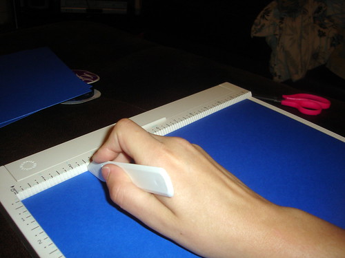
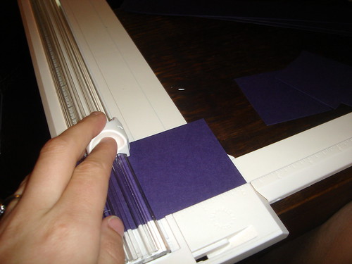
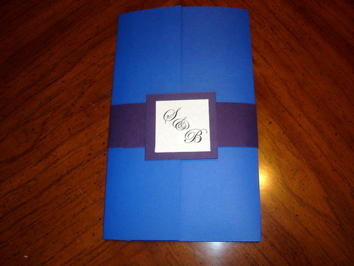
So... starting with a
12x12 sheet, cut of the top leaving 8.25" behind for the pocketfold itself.

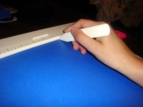
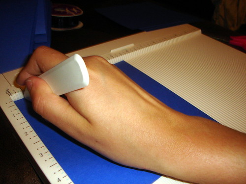
Take your 8.25x12 sheet and score it at 2.5" from the left,
and 7.5" from the left. (This is going to leave you with a 4.5" pocket on the right, a 5" center, and a 2.5" fold. When you fold it all up the fold will come to the exact center. Except because the pocket is only 4.5" you can't do an exact point from the end. Although if you wanted to start the point 0.5" out, I think that could work. It just wouldn't have been symmetrical which would have bugged me.)
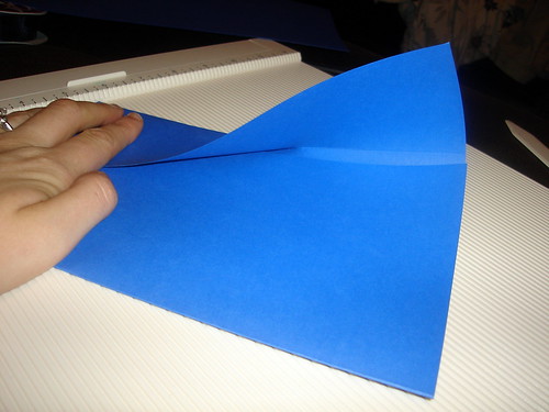
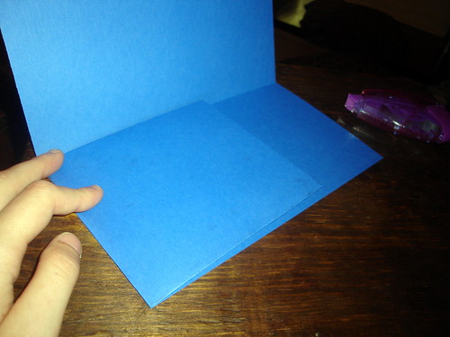
Fold up into a pretty little tri-fold.
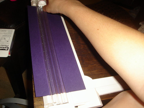
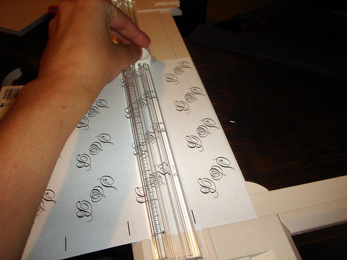
Start with a brand new sheet of 12x12 paper (preferably one of the same color) and cut out a 5.5"x5.5" square for the pocket. (Mrs. Deviled Egg actually used her leftover scrap from the first step and stuck it on the side. But since I wanted to pocket from the bottom, and tall enough to reach the words RSVP, I used a new sheet. Because of this I needed 5 sheets of paper for 4 invitations. But depending on how high you want the pocket you can change the length, and safe yourself an extra piece of paper.)
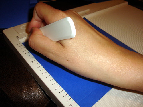
Score the pocket 0.5" from the left,
and 5" from the left (or 0.5" from the right).

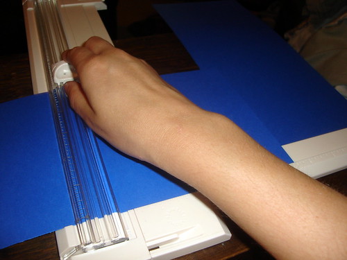
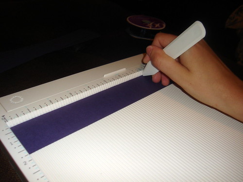
Rotated 90 degrees and again score at 0.5" from the left.
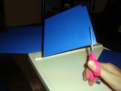
Comparing this next step to Mrs. Deviled Eggs' I did this completely wrong, which is probably why I had somewhat of a difficulty folding. But it worked out. I just cut out the corner, while Mrs. Deviled Egg cut out a little more at an angle. I guess the lesson here is even if you screw these simple directions up (which I did), you can still pull it off. (And do you have any idea how hard it is to photograph yourself cutting something?)
Now use your handy-dandy tape runner on each side as you fold them over,
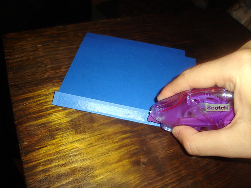
and attach to the trifold. (I found this to be one of the most annoying steps. It was such a pain to get the pocket to not hang over the right, and still have the fold work on the left, but again I made it work.)
Now you have your pocketfold! From here I went to creating the actual invitation itself, but since it involves cutting and scoring I figured it'd make sense to instead explain the bellyband here. (Not that it requires a ton of explanation.) And again I did this step last, but since you can easily slide the bellyband off and one there's no reason why you couldn't do it now. Let's begin...
Cut off a 1.5" band from a 12x12 sheet of paper. (I used the leftover scraps from the invitation backing, but you could just as easily start with a new sheet of paper.)
Score at 2.5" from the left,

and a 7.5" from the left.
Fold and attach bellyband so the 2.5" portion is on the top. (I actually didn't glue this part together at first and just relied on the monogram to hold the whole thing together. But later discover if I glued, aka used my tape runner, both times it held together better.)
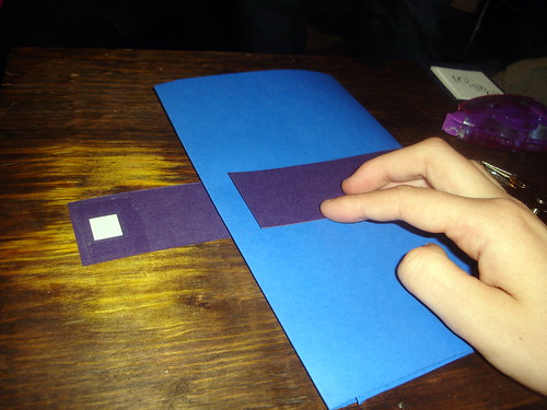
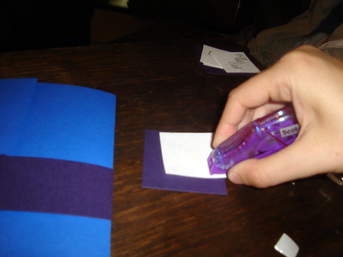
Cut out a 2.25" square, or whatever size you think would work best. (And again I used the scraps leftover from the invitation backing.)
Cut out a monogram. (I made mine to be 1.75"x1.75" using Adobe InDesign, which I'll get to in my next post, but these are simple enough you could just as easy use Word.)
Finally glue the monogram to the purple square,
and the purple square to the bellyband,
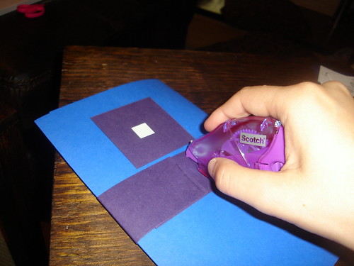
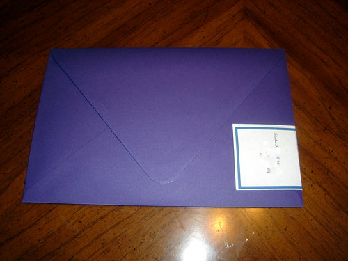
and with no effort at all (err... right...) we have our beautiful pocketfold complete with bellyband!
Was anyone else crazy enough to make your own pocketfolds or did you just buy them ready made? Or if you not quite ready for invitations, do you think you'd ever be crazy enough make your own pocketfolds?

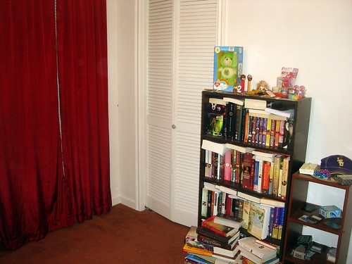
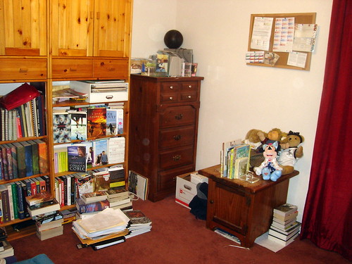
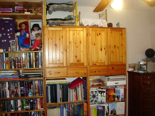
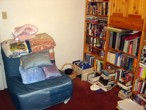
 This week the theme for Show Us Your Life is kid's rooms, except we don't actually have a kid that lives in our house. So instead I'm showing off what we call our library.
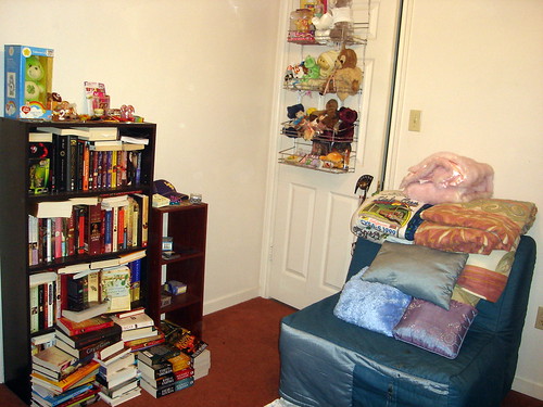


 Celebrating Interfaith Marriages by Rabbi Devon A. Lerner
 Today I'm linking up with Blonde Undercover Blonde for Book Club Friday!


 Brave
Brave