I thought it was awfully amusing how many of you commented regarding the "of __" on the RSVP card, that was where I had to start this post.
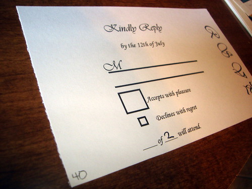
Except of course as with so many other aspect of our suite this isn't an original idea. I'm not saying the image below is the first place I saw this, but it is the only one that made it to the pinboard. Enter Miss Wizard's RSVP card...

via Miss WizardI think it's safe to say here, that not only did I borrow that phrase from Miss Wizard, but the overall look of the card. One thing that didn't come from her was the giant box for accepting compared to the small box for declining (although it did still come from weddingbee browsing through the archives).

sourceOn the back for the mailing address I used the same font used to address both the actual invitations and STDs, French Script.
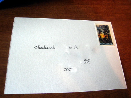
I used the same forever stamp to match the mailing envelope, although was paranoid that I was forgetting to add it. And considering the first two RSVPs came back without it, hopefully most of our guests did get an addressed RSVP.
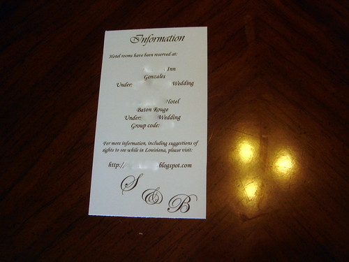
The information card probably requires the least amount of explanation. I have the names of the hotels I've booked rooms at. One is closer to the venue, but basically a motel. And the other is further from our venue, more expensive, but still the one I'd recommend and where I'd want to stay. I also have our wedding website here promising a list of suggested sights, except haven't actually taken the time to write them yet. Instead I'm here describing the invites, but eventually it WILL happen. And of course our monogram shows up again.
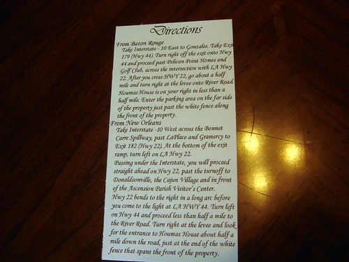
I pulled the directions directly off our venue's website. They probably are a little word-y, but if this is how they want to lead tourists to their site, it's probably the easiest way for someone not familiar with the area.
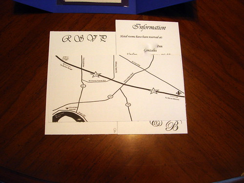
Now to the map, which has to be one of my favorite parts. I used
Mrs. Ballet Flat's tutorial, so rather than give you my own, I'd recommend that you read hers. It actually just uses powerpoint, which you probably have used before, and is really easy to follow. I love the gorgeously designed maps that basically look like art, and while this isn't quite that, I'm still little obsessed with the little touches I added. (The ferry boat on the Mississippi River, the LSU Tiger on the way towards Baton Rouge, and the fleur de lis on the way to New Orleans.)
I don't think I ever expected I'd have so much to say about our invitations, but hopefully you're finding these enjoyable (or even useful) because I still see another invite post (or two!) in the future.


No comments:
Post a Comment