15 hours ago
Friday, June 29, 2012
Show Us Your... Kid's Rooms
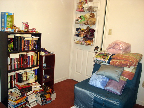
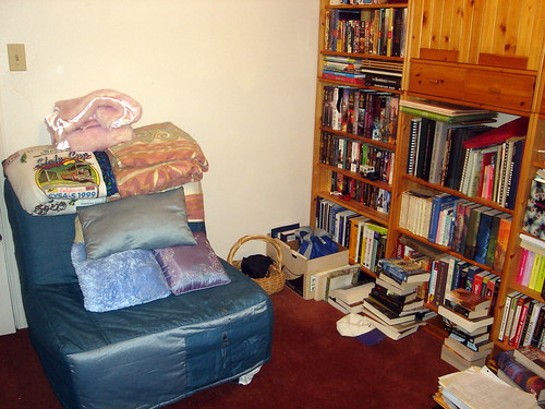
This week the theme for Show Us Your Life is kid's rooms, except we don't actually have a kid that lives in our house. So instead I'm showing off what we call our library.
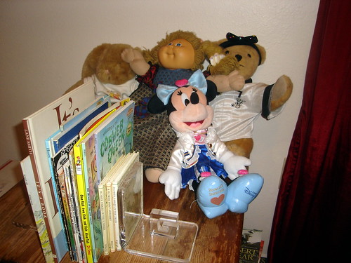
Technically though, if there's any room that could be classified as a kid's room this would be it. And if you were to ask the boy's niece, she would tell you this was her room. This is the door into the library, and I think by the number of stuffed animals on it can be called a kid's room. The chair next to folds out into a bed, which is where the boy's niece has slept whenever she's spent the night here.
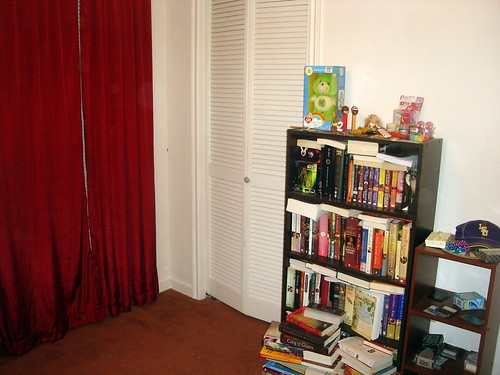
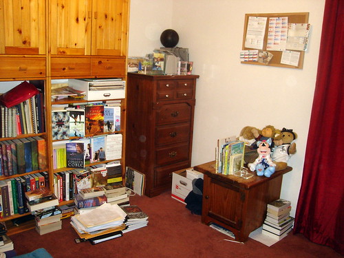
I have actually blogged this room before, and if you were to compare these two posts you'll find the biggest change is that we've run out of room for books.
There's obviously not just stacks all over the ground, but books that I've basically stuffed onto book shelves.
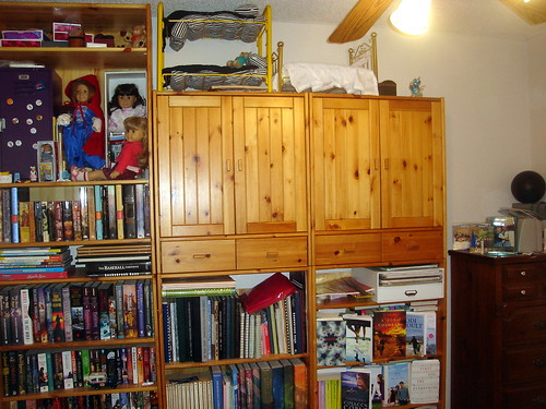
On the top shelf are my American Girls dolls, high enough to keep them safe from small hands.
Which brings us back to the same chair we started with. And since this post is technically for kid's rooms, here is at least the children books that currently reside in our library.
Does anyone else have their home overrun by books? And if you're here from Kelly's Korner, but sure to say hello!
Creating Your Jewish/Christian Ceremony
Celebrating Interfaith Marriages by Rabbi Devon A. Lerner
About a year and a half ago my mom sent me a copy of this book. (And by that I really mean she had someone on paperbackswap send it to me, but close enough.) At the time I hadn't really started thinking about or ceremony, but now that we're almost 2 months away it seems like the perfect time to pick it up.
I actually found this far more interesting than I expected and different than what I anticipated as well. I was thinking this would be more of a self-help type book or making an interfaith marriage work, instead it's exactly as the subtext describe, basically an instruction manual on creating your interfaith ceremony.
The book starts off by outline the important aspects of Jewish ceremony, as well as Christian ceremony from a variety of denominations. Then it includes a few sample ceremonies that are again based on Judaism and different denominations. Finally it breaks the ceremony down and gives several different passages that could be used for each aspect of the ceremony.
And since I can't write this review without at least commenting on the fact it was from my mom, there were a few times reading this where I would have loved to share items with my mom. For example there's a few wedding passages that our sourced to the Rabbi Emeritus at the temple I grew up going to. I had no idea that he was so widely known in the Jewish community, but it is interesting to see his name in print. And of course, reading this, I can't help but wish my mom was still here so I could talk about various aspects or passages I'm thinking of including, with her.
No this book isn't Anita Diamant's The New Jewish Wedding, but it's much narrower in its scope. (And Diamant's book is actually used as a source.) I do think that if your having a Jewish ceremony (interfaith or not) and you want to have some sort of say in the customizing of your ceremony you should read this book. (I even think if you aren't Jewish, but are planning on writing your own ceremony you could benefit from this.)
4.5/5
Today I'm linking up with Blonde Undercover Blonde for Book Club Friday!
Thursday, June 28, 2012
Behind the Labels
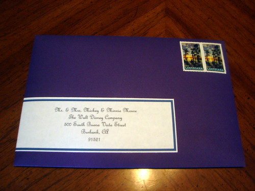
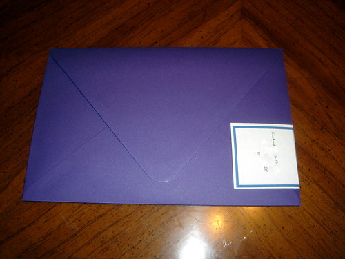
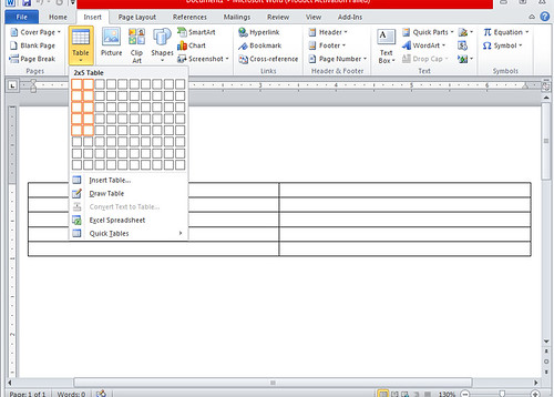
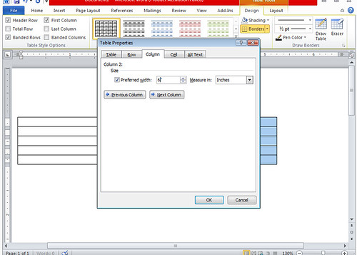
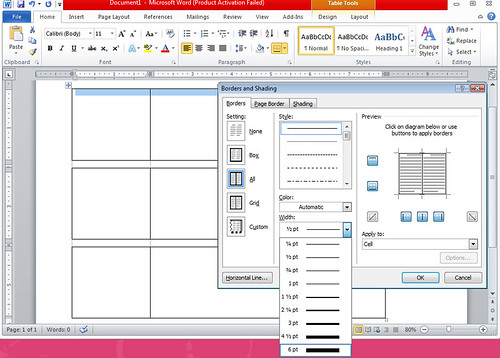
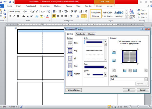
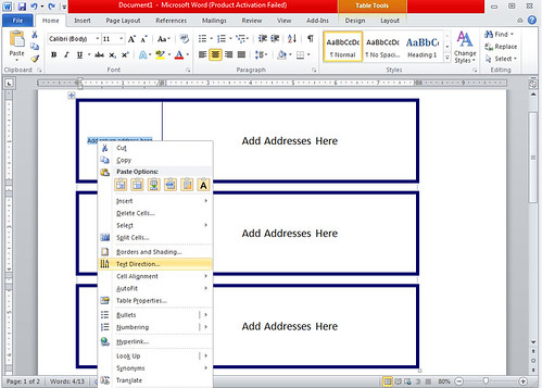
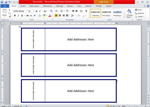
When it came to addressing our envelopes I knew I wanted wraparound labels. I loved the idea of calligraphy, but I just didn't think the money was worth it. I didn't want to attempt to print directly on envelopes. And I don't have pretty enough writing to hand address them. Plus I think wraparound labels looks fairly professional, and not too labor intensive. With all my success finding already made tutorials, I was sure I'd also fine one for wraparound labels. But all I really found was Martha Stewart's template, which was adobe, and I wasn't completely sure how to do a mail-merge in adobe. I did find someone who said they made their wraparound labels in word, so I figured after all the design work I already put into the invites, coming up with wraparound labels would be a snap. It actually wound up being a lot easier than I thought, and if I had known how easy, probably wouldn't have wasted time google-ing one. But since I was determined to find a template and failed, I'm sure there's others on a similar mission. So here's my official Microsoft Word wraparound label tutorial. Insert a 2x5 table. Set your first column to its desired width. (For me that was 2", but depending on how much you want on the back that can change.) Set the second column to your desired width. (Again for me this was 6".) This probably should have been my first step, but this is when I actually remembered to change the printer to landscape, so it would actually look and print correctly. Set the top, middle, and bottom row to your desired height. (I actually wanted to use 2" here, but doing so only fit 2 labels on the page. Instead I used 1.82" which got all 3 to fit.) Highlight the 2nd row and right click to get to Borders and Shading. You want to click the left, middle, and right border to get rid of them, and then do the same on the 4th row. Go to Borders and Shading, this time for row 1, and change to desired thickness. (I used 6pt, which is the maximum available (at least easily available... there may be ways to make them thicker that I'm basically too lazy to research.)) There you can also change the color. You'll need to click the desired border to apply the change. Here you can tell I've already applied it on the left and right, but not the top or bottom. For the middle I went back down to 1/4 pt, and from here you need to click the middle border to apply it. And since I had no idea this existed until I was making my labels, there's an easy way to change the direction for the return address as well. Now you're ready for your mail-merge! Which I won't be doing a tutorial on, because I still have issues with it. But I'm sure if you look there's tons of tutorials on that out here.
How did you decide to address your invitations? Did anyone else go with wraparound labels?
Wednesday, June 27, 2012
Behind the Inserts
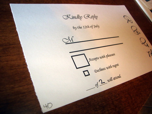
I thought it was awfully amusing how many of you commented regarding the "of __" on the RSVP card, that was where I had to start this post.
Except of course as with so many other aspect of our suite this isn't an original idea. I'm not saying the image below is the first place I saw this, but it is the only one that made it to the pinboard. Enter Miss Wizard's RSVP card...
via Miss Wizard I think it's safe to say here, that not only did I borrow that phrase from Miss Wizard, but the overall look of the card. One thing that didn't come from her was the giant box for accepting compared to the small box for declining (although it did still come from weddingbee browsing through the archives).
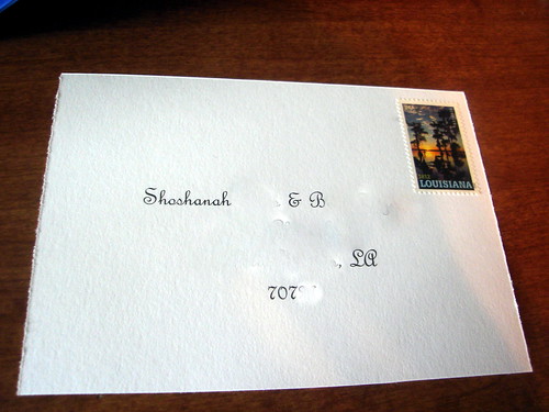
source On the back for the mailing address I used the same font used to address both the actual invitations and STDs, French Script.
I used the same forever stamp to match the mailing envelope, although was paranoid that I was forgetting to add it. And considering the first two RSVPs came back without it, hopefully most of our guests did get an addressed RSVP.
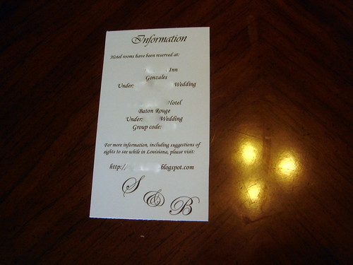
The information card probably requires the least amount of explanation. I have the names of the hotels I've booked rooms at. One is closer to the venue, but basically a motel. And the other is further from our venue, more expensive, but still the one I'd recommend and where I'd want to stay. I also have our wedding website here promising a list of suggested sights, except haven't actually taken the time to write them yet. Instead I'm here describing the invites, but eventually it WILL happen. And of course our monogram shows up again.
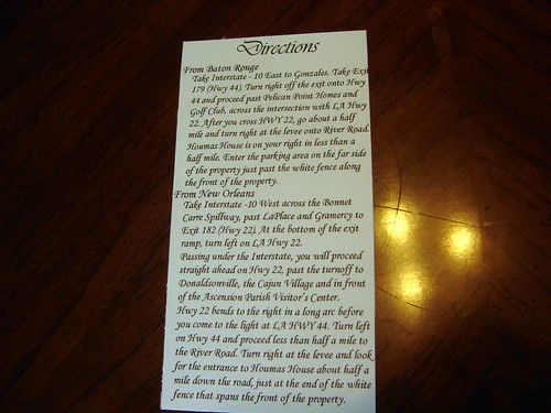
I pulled the directions directly off our venue's website. They probably are a little word-y, but if this is how they want to lead tourists to their site, it's probably the easiest way for someone not familiar with the area.
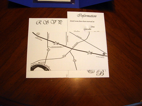
Now to the map, which has to be one of my favorite parts. I used Mrs. Ballet Flat's tutorial, so rather than give you my own, I'd recommend that you read hers. It actually just uses powerpoint, which you probably have used before, and is really easy to follow. I love the gorgeously designed maps that basically look like art, and while this isn't quite that, I'm still little obsessed with the little touches I added. (The ferry boat on the Mississippi River, the LSU Tiger on the way towards Baton Rouge, and the fleur de lis on the way to New Orleans.)
I don't think I ever expected I'd have so much to say about our invitations, but hopefully you're finding these enjoyable (or even useful) because I still see another invite post (or two!) in the future.
via Miss Wizard
source
I don't think I ever expected I'd have so much to say about our invitations, but hopefully you're finding these enjoyable (or even useful) because I still see another invite post (or two!) in the future.
Tuesday, June 26, 2012
Behind the Invitation
My last invitation post delt a lot with mechanics. Cutting paper, scoring paper, tape-running... and while it didn't require a lot of thought, it did take a good amount of time. The post is pretty much the exact opposite, because while creating the invitation itself didn't require a lot of physical time, it did require a lot of thought.
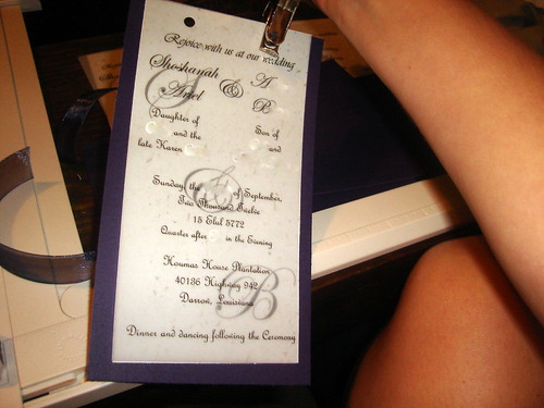
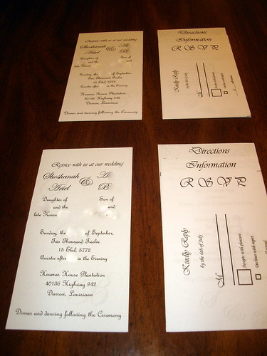
I actually based the look of the main invitation on the bat mitzvah invitations my mom created for me (and later the ones she created for my brother's bar mitzvah). Both times she put the ceremony details on a piece of vellum, and underneath, so you could see it through the text, was our first initial. (But here, instead of a single letter I used our monogram.) She attached it all to a piece of colored cardstock (I believe a purple-ish pink for me, and blue or green for my brother) and "sewed" them all together with a piece of ribbon. (I still remember being at sleep-away camp and my mom mailing me several ribbon samples telling me to mail back the one I wanted her to use.) It's been years since I've actually seen one of our invitations, but obviously it was something I haven't been able to forget, and I think I captured the memory quite well.
In the process of "sewing" the invite As for the wording of the invite, a lot of it is from Anita Diamant's The New Jewish Wedding. Borrowing her words she says,
As you'll probably notice by looking at our monogram the boy doesn't use his first name. But coincidentally both my middle name and his first name start with the letter "A". I had originally planned on creating an ampersand that not only looked like an "and" sign but also an "A". (Bridesmaid Chicago even took the time to design something that we could have used.) But when I started creating the invitation the idea of actually designing a new image seemed a little daunting to me. Instead I went through every font on my computer to find an ampersand that could work. That font was Edwardian Script, and I think if you look at the shape long enough you can find an "A" or two.
With our parents' names, I knew I didn't want to leave my mom off. Traditionally I've just seen invitations that list those who are still alive, but when I saw Mrs. Hawk's invitation wording, I knew listing her as "the late..." was the perfect solution.
Invitation Mock-Ups For the date I checked with the boy and his thoughts on how to spell out 2012. He actually taught a class this past year where his students had to spell out numbers, and informed me that two thousand twelve (instead of two thousand and twelve) was indeed, mathematically correct.
I included the Hebrew date of our wedding next, again a line from The New Jewish Wedding seems to explain this choice best.
I did think about blurring the address of our wedding location, but thought since you already know where we're getting married, it would only take a brief google search to discover the address.
For the last line, I used the first quote I showed you from Diamant's book again for inspiration. I felt that including dancing as well as dinner, would give a better feeling of the reception I'm hoping to have.
While I've talked a lot about where each aspect of the invitation came from, I haven't really touched on the design. I actually used Adobe InDesign to design the entire invitation suite, and what I think is more impressive is that until I started these I had never even opened it. Basically I used Miss Wizard's InDesign tutorial and googling my way through any stumbling blocks. I'm not going to attempt to give any type of design help since I still don't really understand it. But again coming from someone who had never even opened InDesign before, until I came up with my own invitation suite, tells you exactly how helpful her tutorial was to me.
I had actually planned on using the post to explain the inspiration behind our inserts as well, but considering I've already written a novel I'll stop here and leave that to the next time.
And if you're already design (or have started designing) your invitations, where are you drawing your inspiration from?
I actually based the look of the main invitation on the bat mitzvah invitations my mom created for me (and later the ones she created for my brother's bar mitzvah). Both times she put the ceremony details on a piece of vellum, and underneath, so you could see it through the text, was our first initial. (But here, instead of a single letter I used our monogram.) She attached it all to a piece of colored cardstock (I believe a purple-ish pink for me, and blue or green for my brother) and "sewed" them all together with a piece of ribbon. (I still remember being at sleep-away camp and my mom mailing me several ribbon samples telling me to mail back the one I wanted her to use.) It's been years since I've actually seen one of our invitations, but obviously it was something I haven't been able to forget, and I think I captured the memory quite well.
In the process of "sewing" the invite
"You needn't be "honoured" to invite people-you can be "pleased" or "happy" or "delighted." Their "participation" might be as important to you as their "presence." You might decide to invite people to "dance at" your wedding rather than just "attend.""Since the boy & I (or mainly him) are paying for the bulk of the wedding (along with very generous contributions from various family members), I had both of our names next.
As you'll probably notice by looking at our monogram the boy doesn't use his first name. But coincidentally both my middle name and his first name start with the letter "A". I had originally planned on creating an ampersand that not only looked like an "and" sign but also an "A". (Bridesmaid Chicago even took the time to design something that we could have used.) But when I started creating the invitation the idea of actually designing a new image seemed a little daunting to me. Instead I went through every font on my computer to find an ampersand that could work. That font was Edwardian Script, and I think if you look at the shape long enough you can find an "A" or two.
With our parents' names, I knew I didn't want to leave my mom off. Traditionally I've just seen invitations that list those who are still alive, but when I saw Mrs. Hawk's invitation wording, I knew listing her as "the late..." was the perfect solution.
Invitation Mock-Ups
I included the Hebrew date of our wedding next, again a line from The New Jewish Wedding seems to explain this choice best.
"Don't be afraid to use Hebrew. A transliterated word or a few clearly translated words used in the tesxt or graphic design informs your guests that Jewish tradition will be honored at your wedding. And don't worry about confusing people with the unfamiliar; in general, both non-Jews and Jews are far more intrigued than intimidated by the presence of Jewish elements in an invitation."For the time listed I have quarter after the hour shown. But secretly the ceremony starts at the half hour. I figured that showing a time 15 minutes early would help to stop late arrivals.
I did think about blurring the address of our wedding location, but thought since you already know where we're getting married, it would only take a brief google search to discover the address.
For the last line, I used the first quote I showed you from Diamant's book again for inspiration. I felt that including dancing as well as dinner, would give a better feeling of the reception I'm hoping to have.
While I've talked a lot about where each aspect of the invitation came from, I haven't really touched on the design. I actually used Adobe InDesign to design the entire invitation suite, and what I think is more impressive is that until I started these I had never even opened it. Basically I used Miss Wizard's InDesign tutorial and googling my way through any stumbling blocks. I'm not going to attempt to give any type of design help since I still don't really understand it. But again coming from someone who had never even opened InDesign before, until I came up with my own invitation suite, tells you exactly how helpful her tutorial was to me.
I had actually planned on using the post to explain the inspiration behind our inserts as well, but considering I've already written a novel I'll stop here and leave that to the next time.
And if you're already design (or have started designing) your invitations, where are you drawing your inspiration from?
Monday, June 25, 2012
Monday Movie Review
Brave
I love pretty much all Pixar movies, so it's no surprise that I was incredibly excited to see this. And while I did enjoy it, and will probably watch it over and over once I have kids of my own, and can't wait to see Princess Merida at Disneyland, it was probably one of the weaker Pixar movies.
What didn't work for me? Well, I wasn't a huge fan of the music. The music did fit the movie in that it was felt like old Scottish songs, but it just didn't seem memorable to me. And the fact that the boy saw the previews and then said, "I think this is going to be the plot of the movie," and he was 100% right. We also took the boy's niece and nephew to see the movie, and I feel like when we see movies with them it's hard for me to lose myself in the movie since I'm also trying to keep track of them.
But even with those complaints, I don't think you should miss it, and even see it with 3-D if you can. My opinion is, that if you are going to see a Pixar movie, 3-D is definitely the way to go. And I figured I'd leave you with an image of the 2 kids waiting for the movie to start.
So, it's not the clearest picture, but it's still fun!
I love pretty much all Pixar movies, so it's no surprise that I was incredibly excited to see this. And while I did enjoy it, and will probably watch it over and over once I have kids of my own, and can't wait to see Princess Merida at Disneyland, it was probably one of the weaker Pixar movies.
What didn't work for me? Well, I wasn't a huge fan of the music. The music did fit the movie in that it was felt like old Scottish songs, but it just didn't seem memorable to me. And the fact that the boy saw the previews and then said, "I think this is going to be the plot of the movie," and he was 100% right. We also took the boy's niece and nephew to see the movie, and I feel like when we see movies with them it's hard for me to lose myself in the movie since I'm also trying to keep track of them.
But even with those complaints, I don't think you should miss it, and even see it with 3-D if you can. My opinion is, that if you are going to see a Pixar movie, 3-D is definitely the way to go. And I figured I'd leave you with an image of the 2 kids waiting for the movie to start.
Sunday, June 24, 2012
Mailbox Monday (3)
I've gone a few weeks with no new books, which considering the number of books sitting around in my house waiting to be read, is a good thing. But today I'm back linking up with Mailbox Monday, to share the new addition to my to-read pile. Mailbox Monday was originally created by Marcia formerly of The Printed Page, and each month travels to a new host. This week our host is Burton Book Review and I'm sharing...
Borrowed from a Friend
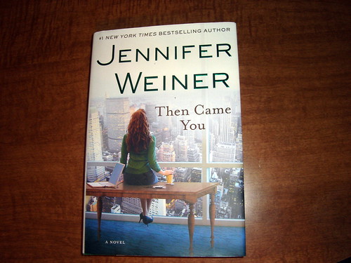
Then Came You by Jennifer Weiner
Just one this week, but one I've really excited to read! I haven't read everything by Jennifer Weiner, but I have read quite a bit, and I've loved each one. I still can't believe I've waited this long to read it, especially since it's already out in softcover and since her new book is about to be released (at least I believe that's the case). But now that I have it, I won't be waiting long to read it, and even went and started the first chapter last night!
What did you find in your mailbox this week?
Friday, June 22, 2012
Behind the Pocketfold
After yesterday's big invitation reveal, I wanted to spend a little time today (and the next few posts as well) explaining exactly how I made the whole thing. I know while I was making these I read post after post of how-to (the most important I plan on linking to), and hopefully these following posts can help some other poor bride who wants to diy her invitations without any idea on how to get started.
If you remember a few weeks ago I posted how I bought a ton of 12x12 scrapbooking paper to use for the pocketfolds. But when I went to start looking for pocketfold directions I found most brides used 11x17 or 17x17 sheets of paper. If I was smart I would had researched this before spending over $100 on paper. But luckily I did find this post from Mrs. Deviled Eggs which contained a tutorial of making a pocketfold from a 12x12 sheet.
The easy thing her would just be to take you to Mrs. Deviled Eggs' post, but I know that I rarely click on links unless I really care. So by posting my own version of instructions I've either saved you one extra click, or made you read something you wouldn't have otherwise. And while I've made a few minor changes here, the bulk of this information is Mrs. Deviled Eggs'.
So... starting with a 12x12 sheet, cut of the top leaving 8.25" behind for the pocketfold itself.
Take your 8.25x12 sheet and score it at 2.5" from the left,
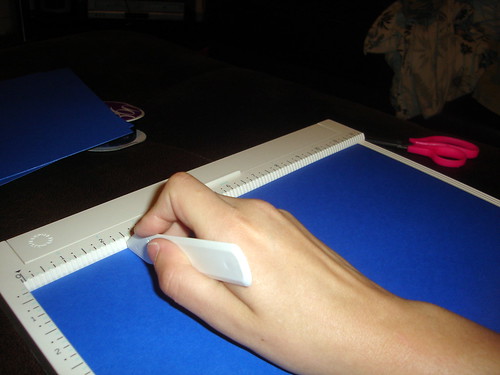
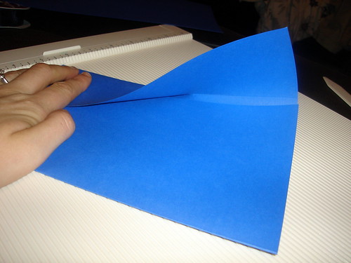
and 7.5" from the left. (This is going to leave you with a 4.5" pocket on the right, a 5" center, and a 2.5" fold. When you fold it all up the fold will come to the exact center. Except because the pocket is only 4.5" you can't do an exact point from the end. Although if you wanted to start the point 0.5" out, I think that could work. It just wouldn't have been symmetrical which would have bugged me.)
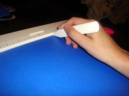
Fold up into a pretty little tri-fold.
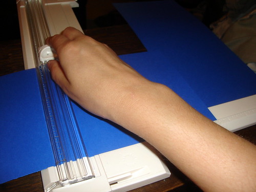
Start with a brand new sheet of 12x12 paper (preferably one of the same color) and cut out a 5.5"x5.5" square for the pocket. (Mrs. Deviled Egg actually used her leftover scrap from the first step and stuck it on the side. But since I wanted to pocket from the bottom, and tall enough to reach the words RSVP, I used a new sheet. Because of this I needed 5 sheets of paper for 4 invitations. But depending on how high you want the pocket you can change the length, and safe yourself an extra piece of paper.)
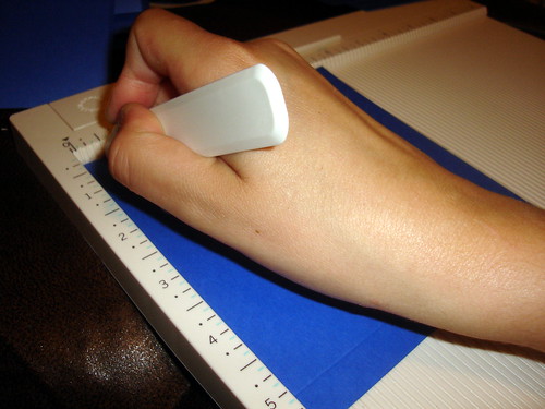
Score the pocket 0.5" from the left,
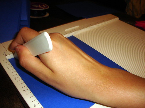
and 5" from the left (or 0.5" from the right).
Rotated 90 degrees and again score at 0.5" from the left.
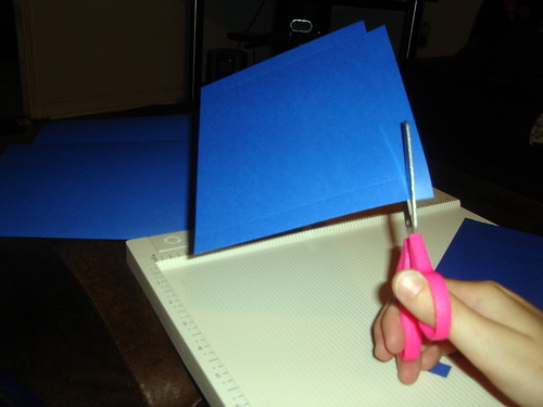
Comparing this next step to Mrs. Deviled Eggs' I did this completely wrong, which is probably why I had somewhat of a difficulty folding. But it worked out. I just cut out the corner, while Mrs. Deviled Egg cut out a little more at an angle. I guess the lesson here is even if you screw these simple directions up (which I did), you can still pull it off. (And do you have any idea how hard it is to photograph yourself cutting something?)
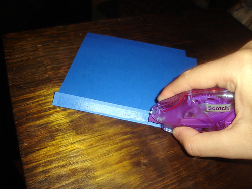
Now use your handy-dandy tape runner on each side as you fold them over,
and attach to the trifold. (I found this to be one of the most annoying steps. It was such a pain to get the pocket to not hang over the right, and still have the fold work on the left, but again I made it work.)
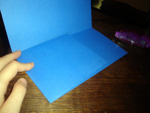
Now you have your pocketfold! From here I went to creating the actual invitation itself, but since it involves cutting and scoring I figured it'd make sense to instead explain the bellyband here. (Not that it requires a ton of explanation.) And again I did this step last, but since you can easily slide the bellyband off and one there's no reason why you couldn't do it now. Let's begin...
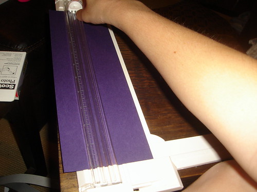
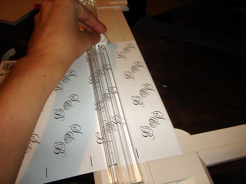
Cut off a 1.5" band from a 12x12 sheet of paper. (I used the leftover scraps from the invitation backing, but you could just as easily start with a new sheet of paper.)
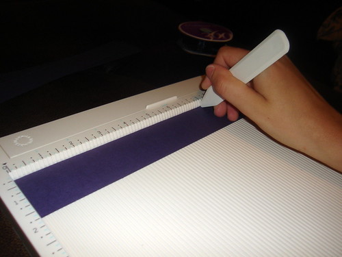
Score at 2.5" from the left,
and a 7.5" from the left.
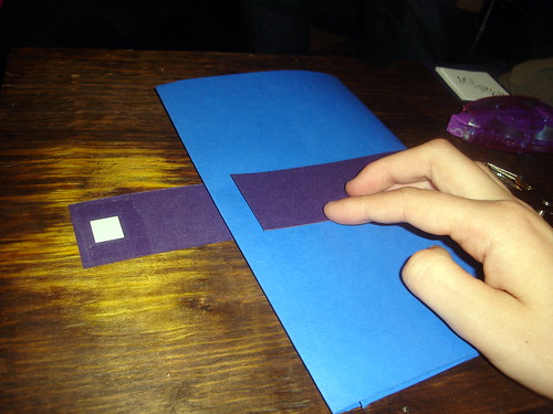
Fold and attach bellyband so the 2.5" portion is on the top. (I actually didn't glue this part together at first and just relied on the monogram to hold the whole thing together. But later discover if I glued, aka used my tape runner, both times it held together better.)
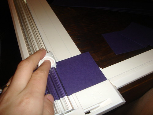
Cut out a 2.25" square, or whatever size you think would work best. (And again I used the scraps leftover from the invitation backing.)
Cut out a monogram. (I made mine to be 1.75"x1.75" using Adobe InDesign, which I'll get to in my next post, but these are simple enough you could just as easy use Word.)
Finally glue the monogram to the purple square,
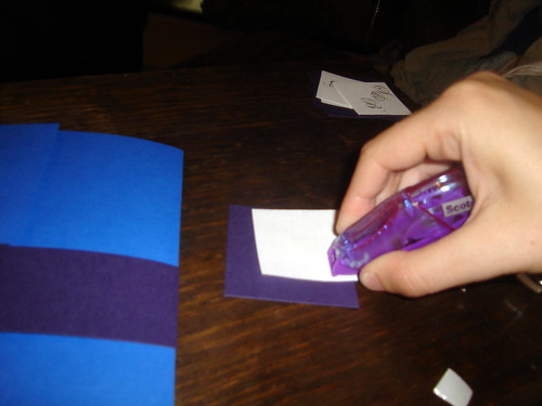
and the purple square to the bellyband,
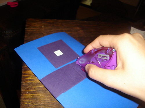
and with no effort at all (err... right...) we have our beautiful pocketfold complete with bellyband!
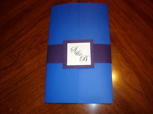
Was anyone else crazy enough to make your own pocketfolds or did you just buy them ready made? Or if you not quite ready for invitations, do you think you'd ever be crazy enough make your own pocketfolds?
If you remember a few weeks ago I posted how I bought a ton of 12x12 scrapbooking paper to use for the pocketfolds. But when I went to start looking for pocketfold directions I found most brides used 11x17 or 17x17 sheets of paper. If I was smart I would had researched this before spending over $100 on paper. But luckily I did find this post from Mrs. Deviled Eggs which contained a tutorial of making a pocketfold from a 12x12 sheet.
The easy thing her would just be to take you to Mrs. Deviled Eggs' post, but I know that I rarely click on links unless I really care. So by posting my own version of instructions I've either saved you one extra click, or made you read something you wouldn't have otherwise. And while I've made a few minor changes here, the bulk of this information is Mrs. Deviled Eggs'.
So... starting with a 12x12 sheet, cut of the top leaving 8.25" behind for the pocketfold itself.
Cut off a 1.5" band from a 12x12 sheet of paper. (I used the leftover scraps from the invitation backing, but you could just as easily start with a new sheet of paper.)
Subscribe to:
Posts (Atom)